Friday, May 18, 2007
Lets work together
Cartographic design in today’s world is all about collaboration. There are no projects that are not reviewed, edited, fixed, noted, helped to produce, or at least referenced. Every thing in the world has been mapped to death, so today’s cartographers have the option of reproducing old maps. To do this, the cartographer has to collaborate with at least the original cartographer who produced the original production in the original projection. This referencing is the first step of collaboration. The next step is producing the thing worth producing and collaborating with other professionals and experts to come up with the best solution to any problems the publication may or may not accomplish. This could be in many forms, over the internet, through email, in an office, or simply by oral suggestion from one ideas-man to another. The next step is to send a pseudo finished piece off to an editor or publisher; this person or people mark it up and change the project to there specific specifications. This is usually done by many means of communication, but usually it’s done by people within the company or firm responsible for the print. All of these processes’ are done with a means to a greater good. All the cartographic communication and cartographic knowhow bundled into a package to try and create the best finished product available. With a single cartographer, we can only get one set of ideas, one manipulation of content, but with even two cartographers the ideas multiply exponentially and build upon each other for ever. Based upon this basic premise, multiple cartographers working on a project simultaneously is obviously preferred to a single projecteer.
Thursday, May 17, 2007
NEVADA!
Nevada is an unbelievable place. It is full of desert, mountain, and forest. The government owns most of the state and the parts they don’t are owned by mining companies or railroads. This is a good and a bad thing for mapping the state. The good thing is there is a myriad of data available from the census and other government organizations, so data collection is not an issue. However, the bad thing about Mapping Nevada is out of the 17 counties, about 90% of the population is located in two of them. The other fifteen shows up as blanks in pretty much every data set you have. This makes the types of maps and how you show your maps very important. Meaning you can lie very easily in Nevada because of the types of data. Many mapmakers have shown this by creating multiple layers with differing transparencies; this creates an interesting effect on the mapped layers. By changing even the amount of categories you have to work with, you can change how the map looks and therefore how individuals interpret the information. With these different looks created by processing the same data sets is neat in a way, because this gives the mapmaker the ability to tell many different stories just by selecting a variety of categories to map. Instead of the norm where mapmakers are bound by their data and must tell the story the data dictates.
Having Mapped and appreciated the intricacies of Nevada, I have a greater appreciation of the state and how data fields work in other places as well. Nevada is both beautiful and challenging, but it is also worth mapping and needs to be done more.
Having Mapped and appreciated the intricacies of Nevada, I have a greater appreciation of the state and how data fields work in other places as well. Nevada is both beautiful and challenging, but it is also worth mapping and needs to be done more.
The world according to Google
After playing, experiencing, learning, examining, probing, exploring and investigating a plethora of “Virtual Worlds;” such as, Google Earth, Celestia, World Wind, Microsoft Live, and Map Quest. There are many others out there, but they don’t have nearly the publicity. These virtual worlds are an amazing tool for individuals to play around and look at the world. It gives the laymen the opportunity to look at things they wouldn’t normally be able to see. I know plenty of people who have not been out of their home state, but with this new technology they are able to see places around the world, not nearly as intimately of course, but still, fairly closely. These things will all in all make humankind, at least the technological literate with access to the will to these programs, a better understanding of the world and how it works. With this knowledge, hopefully the human race isn’t doomed to oblivion. That’s a good thing.
Virtual worlds are cool. That’s the bottom line. They are fun, cool programs that users can do many things with and create new ideas and communicate in new ways. I love all types of virtual worlds, I’ve been lost in Celestia, I’ve researched trips in map quest, and I’ve incorporated GPS points into Google earth to make movies of trips. Basically, I’ve played with these virtual worlds quite a bit, and if you haven’t, I recommend you do.
Virtual worlds are cool. That’s the bottom line. They are fun, cool programs that users can do many things with and create new ideas and communicate in new ways. I love all types of virtual worlds, I’ve been lost in Celestia, I’ve researched trips in map quest, and I’ve incorporated GPS points into Google earth to make movies of trips. Basically, I’ve played with these virtual worlds quite a bit, and if you haven’t, I recommend you do.
Friday, May 11, 2007
Games
The use of maps in games, no matter the kind, has always been helpful to gamers. I want to look at four types of games; geography based board games, geography based computer games, regular board games, and regular computer games. I want to make the distinction between these different classes because of the way they implement special variability.
Geography based computer games. These can be very interesting and fun games. They usually are geo-trivia sorts of games like find the state on a map, or find the country. However there are a few games which enhance a broader set of geographic ideas, such as: this does a very good job at being geo-trivia and at enhancing special ideals at the same time. However, most people find most geo-computer games to be boring.
Geography based board or card games are common as well. National Geographic has a few out; most of these again are geo-trivia. Such as name the capitol, or find the state. These are well implemented in many classroom activities, but may not be as interesting for the lay person. Some of these games do also promote more than just geo-trivia; they also try and inform the gamer on matters of scale, and why places are where and whatnot.
Regular computer based games are usually quite fun and exciting for many people. If you think about it, most all of these games require a map, a place, or at least a reference to where things are within it. A game like Age of Empires, a popular real time strategy game, has a different map almost every game. Maps are very important to these types of games and the more familiar a gamer is with the games maps or mapping systems, the more successful the gamer will be.
The last category I want to look at is board games. I will split this in half as well; first I will look at board games which utilize maps and then the games which do not. There are many games that use real world maps to instigate play, such as, Risk, Axis and Allies game series, Take Off, and many others. These games make use of the real world to play the game, this does more than just provide an interesting experience for participants, and it also makes the players subconsciously learn something about their world. Certain games such as Axis and Allies will also teach participants about world history, and if the participants know some world history, they will benefit in the strategy of the game. The other types of games are none map based games; such as Chess, Checkers, Stratego, and others. These games may not have a map element to them, but people do have to learn and analyze space to be successful. Chess for example, if a player does not see many possible different moves in different directions and different pieces, they will certainly fail. If the same player can see the whole board as well as the spaces of each piece, success will be much more imminent.
I believe that a person who can see more than one space at a time will succeed more readily in any type of game he or she does pursue. Maps are integral in many types of games and many of those games could not exist without the use and help of maps. This is just another notch on the importance of maps in society today. They benefit our entertainment purposes.
You can see the use of maps in other issues of modern day entertainment. The use of place names to identify a sports team, movies use places to help tell the story… and in all of these they are displayed via the use of maps.
Monday, March 26, 2007
Polotics...
Political geography is the differences between people in there belief in government over a broad range of space. You can look at political views in many different scalar quantities. You can look at and analyze voting and policy matters patterns of people anywhere from one voting district to Carson County to the State of Nevada or on the nation as a whole. Political geography looks at people and their government on different scales, political cartography maps people and their government at a multitude of scales. The basis of political cartography is voting, be it on a specific candidate or on a policy or on a party, or a party’s platform, voting is the primary form of political mapping. Mapping voting patterns.
By mapping these patterns we can see where people are and what there views on everything are. Based on that analysis we can then make deductions about other things on the populous. If, for example, we see and intensely high number of republican voters in an area we may deduce an influx of a certain type of person from that area, and then we can deduce why that area has those types of people. For example, Douglas county Nevada voted republican for pretty much every possible ballot question and office last election. I know from talking with such people that most ranchers are republican. So based on the land use and the available land in Douglas county I would say it has a higher percentage of ranchers than say lawyers or bankers.
Political cartography is a great way to map the U.S. and each state and discover what people believe in each of those regions. You can tell California is more liberal than Nevada based on its voting patterns. Etc.
Michael F. Goodchild does an excellent job in telling of how GIS and politics are affected by each other in his article Just the Facts, Political Geography Quarterly, 10(4): 335-449. This article helps explain many of the fallacies of GIS and its applications and gives a brief overview of political geography.
Basically political cartography maps out how people think about government. This can then indicate how people think in general. This is a great help to human and cultural geographers who are trying to map why people are where and who is where they are. It has become another tool in the democratic world to help indicate where who is and why.
In Vladimir Kolossov's article "American geography and the rise of political geography in Russia". Kolossov explains how political geography and political cartography didn’t exist when the communist government was in control, but as the soviet block fell apart and a democratic system was put into place American geographers and emerging Russian geographers began to map out the new system. This excited American geographers because it enabled them to see how people moved, voted and thought based on where they were from the beginning of the new system. American and Russian geographers monitored and mapped voting patterns and came to many conclusions. The point of the matter being, some governmental systems simply are not good environments for certain science fields. Apparently communism is bad for political geography. But this also makes me think, if this is the case, what sciences or thought process are we missing being democratic? Capitalistic? What could we think about without such governmental controls? I believe it would have mostly to do with people, since that is what government controls, people. So I think government affects the sciences of the people; psychology, sociology, anthropology and of course human geography. But governmental controls could are found that reduce the productivity of biologists, chemists, geneticist, and quite a number of other fields. They do this because the government deems their research unethical. I read an article last week about a research project at Oregon State that was modifying the DNA of rams which would only mount other rams. They were trying to modify the genetic material enough to encourage the rams to mount sheep. This was halted by the governing body because it was encouraging research on gays and could have a negative reaction from the gay community.
Political cartography will live as long as there is a decent electoral body to map. If nobody votes, if nothing is passed, if no issues present themselves before congress, then political cartography will die.
Citation:
Kolossov, Vladimir. 2004. “American geography and the rise of political geography in Russia” GeoJournal 59: 59 – 62.
Thursday, March 8, 2007
The Earth, Moon, Stars and Mars; Now in 3D!
There’re two programs I like to use when I look at three dimensional cartography today, I use one of two programs; either Google Earth, or NASA World Wind. (Follow the links to download these free programs.) These are both wonderful programs and do an enormous amount, but each is slightly different.
Google Earth does a wonderful job of displaying earth in all of its capacities. It represents all earth systems well, some better than others, but all in all it is an incredibly useful program to do research. NASA’s World Wind gives viewers most of the same information with a few differences. But again, this program has a plethora of information to display to its users.
The main differences between these two programs become quickly apparent to most users. Google Earth is set up to handle a cultural geographic aspect of earth, whereas NASA’s World Wind is set up to view earth from a physical geographic point of view. Some of the basic features of Google Earth include dining stops, roads, sightseeing information, lodging, and transportation. World Wind has tools that allow you to look at current precipitation patterns, wind patterns, pressure heights, and ocean current movement. Each program has a search program to locate specific cities or addresses, but Google Earth’s has much more detailed information and incorporates Google Maps into the process. This makes for a very easy way to plan a trip route and decipher how different places work culturally. Some of the advantages of World Wind besides the metrological earth systems include current cloud cover information, recent and current disasters, (such as dust storms, fires, earth quakes, hurricanes, tornadoes, etc…) and different projections of use on the three dimensional level. World Wind also has a tool known as Place Finder, which makes use of Yahoo maps to display similar travel and location information compared to Google Earth. Another fun feature utilized by World Wind is some other layers besides Earth. You can cruise around the moon, Jupiter, Mars, and one of Jupiter’s moons. These may not be useful, but they do provide hours of entertainment (for map geeks like me.)
Google Earth

NASA World Wind

If you want to compare these two three dimensional programs to some two dimensional references, you could say that Google Earth runs much like Rand McNally atlases; it shows human cultural activity, where World Wind acts more like the National Geographical atlas, showing earth systems features.
Three dimensional cartographic programs in general are evenly useful and can show a plethora of information and have many different utilities within them. These programs are a recent addition to a vast cartographic library of resources. These programs are all derived from the same information as a flat wall map.
Another type of three dimensional cartography, which in today’s world of technology is commonly overlooked, is globes. Much how Google Earth was derived from a program like Google Maps, (a 2 dimensional program) globes were derived from flat paper maps. Globes are a great way to view our earth, they show viewers many misconceptions made by looking at maps. For example, I know a girl who would swear on her mother’s grave that Alaska was an island just east of Hawaii and just west of Mexico. Sadly these perceptions of our earth do happen, however globes silence many questions people have about how the earth actually is. Globes are the most accurate tangible reference map people can use today, and I believe they are fundamental in human understanding of earth.
So if you need a basic understanding of this grand world of ours; dust off an old globe and spend a few hours perusing its contents. If you need a detailed route on how to get to aunt Sally’s in New York and what to do when you get there and where to stay and eat on the way and what airport to fly out of and intimate directions on all of these things, go to Google Earth. If you want to know what the five hundred mille-bar height of the atmosphere four days ago was and if it’s going to snow this weekend then tryout World Wind. All in all, you can’t go wrong with three dimensional cartography and the myriad of informative doors it opens up.
Wednesday, March 7, 2007
Artistic or useful?
Old maps, they can be priceless commodities people steal to make money as what has happened countless times, and is very lucrative for those who get away with it. A great example of old map theft is portrayed in Miles Harvey’s The Island of Lost Maps: A true storey of Cartographic Time. What this tells me about ancient maps is that well done historical maps have become priceless commodities to history buffs and appreciators of fine art. Old, historical, good maps are hand drawn, and incredibly detailed; this is what makes them so artistic. This is not to say all old maps are perfect, in fact, most old maps are outdated and are worthless for reference. Old maps are useful to historians who wish to research what happened, but if you have a historical map of a place, you will indubitably get lost.
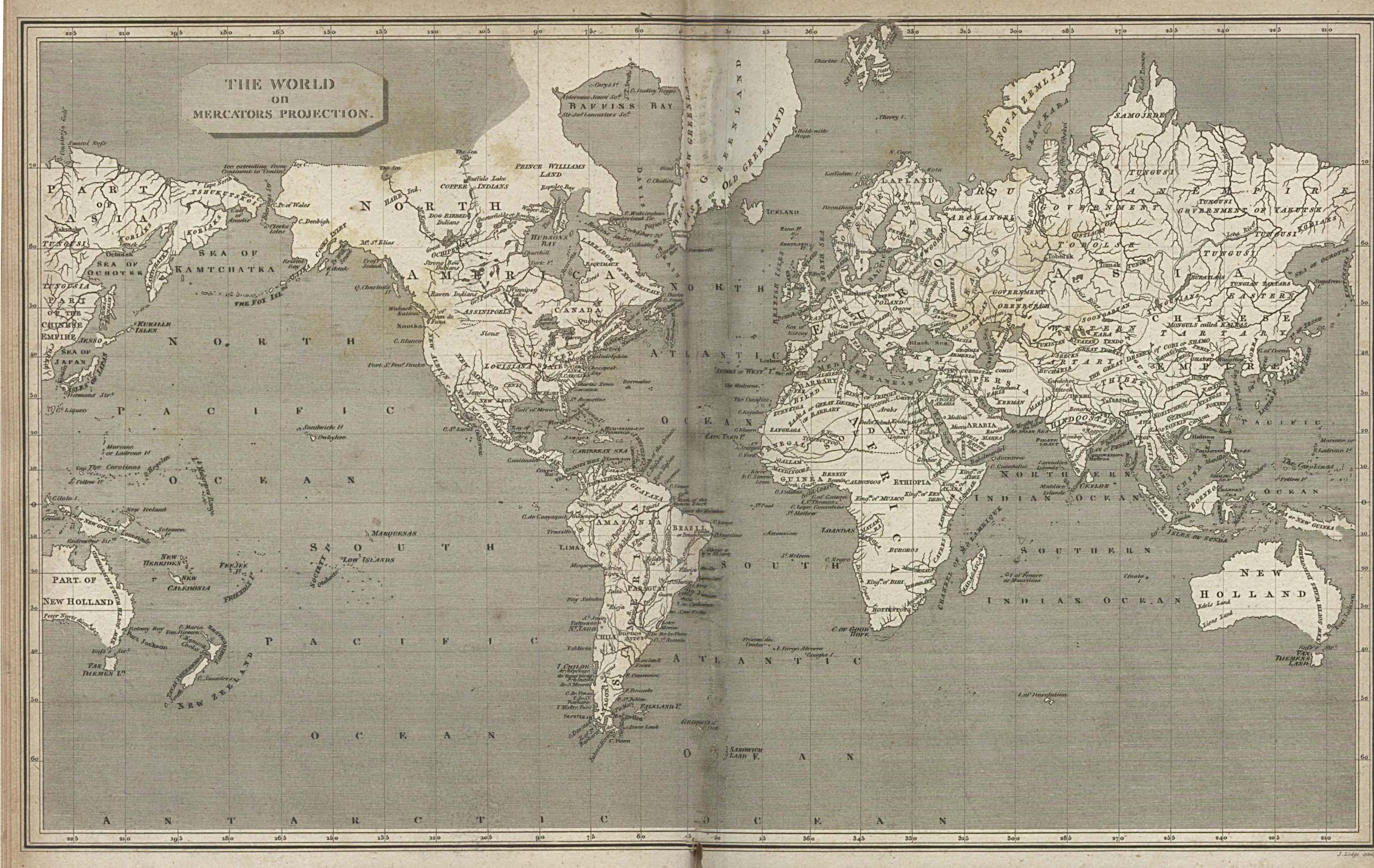
The map to the right is a hand-drawn mercator projection from 1820. This map demonstrates artistic design in antique maps and how precise (if not accurate) the cartography was
Some new maps are of old things. This is also very useful for researchers; it can show visually what happened in a clear concise way. Historical cartographers and historical geographers specialize in this area of study.
New maps, as compared to old maps, are very much less valuable to art critics, but are intensely useful to those wishing to drive from Beeville, Texas to Wells, Nevada. New mapping programs like Google Maps are very useful and very easy to find and use for the every day person. New maps are used to display information visually, but most historians have no interest in them.
National Geographic, or Rand McNally both have atlases to show the populous information, the National Geographic atlas shows useful information about the whole world and is incredibly detailed, whereas Rand McNally’s road atlas is more for people who wish to hit the road and travel across the U.S. It focuses more on the major road systems and towns on them then the smaller rural areas which most people on a road trip will not even notice.
Old Map Links:
New Map Links:
Wednesday, February 28, 2007
The Newsies and their maps
The News. Some people avoid it like the plague, but how can you really avoid a disease that killed one third of the population? The news is often presented in four popular media. TV, Print (newspaper), Radio, and Internet. I want to look at why any news firm would use maps, and then explore what that does to the public.
What is news?
I'll start with Radio. I looked into NPR, or the National Public Radio. Radio news is not a visual medium. Radio news programs use audio to send their message to their viewers. Radio can not use maps to relate data to it's populous.
TV is the ultimate visual medium. TV uses video clips, maps, pictures, interviews and loads of other visual tewture to reveal their message. TV news can be national such as CNN or local news such as News Chanel Eight both use maps to an extent. They may present an issue such as Yucca mountain, the news station provided a map of the transportation routes waste trucks and trains would use to get to yucca mountain. This map helps the veiwers better understand the issue at hand, presently the news stated the issue as being 55% of the waste going through populated places. Without the map people may not understand the issue to its fullest extent. The map helps bring the message home, and tells the veiwers to think, "this is bad, those trucks go by my house." The other types of maps you may happen to see are weather maps. Every news broadcast you see there will be a weather map, an isobar map, a precipitation map, a fronted map. All these maps help Show the people what is happening with the weather.
A third way news is made public is through the newspaper. The local newspaper, the Reno Gazette Journal is more visually based than TV. TV uses a plethera of visuals, but it also uses audio to promote its messege. But newspaper, newspaper is purley visiual. This would make you think that there would be maps all over newspapers, but in truth there are not as many as I would want. There are maps in newspapers, but I find there is a similar amount of cartographic production in newprint as on television. There is a weather map on every newspaper you pick up, from a local paper to a national paper, there is always a weather map.
Internet new sources are everywhere. All of the previous mediums have internet access news and there are other news sites that do not have a radio program, a TV show, or a newspaper, they are just online.
One other topic I wish to touch on before I conclude is the accuracy of newsmatic maps. Newspaper maps may be out of date by the time it's published, TV maps are probably accurate for the most part. I believe that maps in the news are simply to promote the initial topic the map is relevant too. This is a little different than looking at an atlas or the geological survey, where the map shows you all the data you could ever want to know. Maps in the news are not there to stand on their own, if they were to be viewed soley, they would mean nothing to any body, but because they are attached to the story, they help the audience better grasp what they are reading or hearing.
Maps in the news will never be great maps, but I think it's good they are represented in news to help visual people (such as myself) to better understand the possiblity of boring news.
Links:
http://news.rgj.com/
http://www.kolotv.com/
http://www.npr.org/
http://www.cnn.com/
Wednesday, February 21, 2007
Cartographic animation and Interaction in the world today
Animated maps are becoming incredibly common over the internet. You can find them in many places dealing with a plethora of data. You can find interactive history maps, interactive reference maps, interactive maps exploring census data, and a myriad of animated maps concerning a broad range of subjects. Some interactive mapping sites include interactive reference maps such as: Google earth, world wind, virtual earth; some interactive driving directional maps or reference maps such as: Google maps, map quest, yahoo maps. These are all great mapping programs some located exclusively on the web while others can be bought or downloaded.
Some maps such as this interactive map of the united sates shows people the state capitols while the mouse cursor is over each respective state. Other maps show different aspects of history such as this map which shows the holocaust during world war two. Many maps across the internet are animated or have interactive capabilities.
The maps I wish to explore further are different weather maps. Most weather maps have capabilities of animation or interactivity. Weather maps can show a broad variety of things, some of which are radiation, precipitation, visibility, pressure levels, and wind velocity animated maps. Animated weather maps show weather patterns that change over time. This can be extremely useful to weekend travelers or professional meteorologists.
Some animated weather maps are located here: http://www.cpc.noaa.gov, http://www.weather.gov, http://www.wrh.noaa.gov/rev/.
Wednesday, February 14, 2007
American's think about themselves
What is the American identity? How do Americans identify themselves?
It is amazing how many Americans define and see themselves personally and as a nation. When the Americas were first being settled the American identity was anything that was not European. Then as we graduated through time it morphed, changed, was modified by modern thought to become a new identity. Americans now have a different view on the world, how they see the world, how the world sees them, and how they see themselves. I can’t give a perfect definition on what the new American identity is, but I can say it is still not European. It can be said that different Americans have a different identity, but all Americans must have one universal set of beliefs, single idea, or just common perception of something. This is what I will try and explore more thoroughly.
American identity can be traced through a great deal of audible and visual. If you watch a movie made in the sixties, there will be certain views Americans felt placed in the film. If you read a newspaper published during world war II then you would also see American propaganda proliferating America’s ideals and self perpetuation of the American identity as being the best, and as being right. You can also tell an Americans identity by the way the make, view, process, publish, and articulate different kinds of maps.
Look at how many ways America has been mapped. We have the most political maps in the world and the most studied political maps in the world. These maps include voting precincts, percentages , red maps, blue maps, non-voters percentages; a plethora of maps just identifying political analysis. Is political mapping considers Americas identity? No, I think not, but perhaps it helps us understand what America’s identity is. Look at a political map. What does it tell us as viewers? Does it say the country is divided in two? Does Americans with different views hate each other? No, what it does say is what was stated earlier, even thought Americans have different views on something does not mean the have a different identity. There is still something that ties all Americans together.
Other maps have influenced how Americans think besides political maps. Political maps are just taking facts (hopefully truthful facts) and displaying the information visually. We can look at settlement maps and base what Americans identity is based on where they settled. Flow maps of where people came from could give us an idea of a common bond.
Maps are a way of communicating data visually and American identity can be pulled out of specific maps that target what American identity means. I can not classify American identity, but based on what you think about various maps, readings, movies, books, and radio; you can define an American identity. This will probably differ from what somebody else version of the same topic is, but all American identity truly is, is an individuals ideas on Americans as a whole. Of course this idea will change from person to person. But that does not make any one person wrong or right on the matter. So, choose for yourself what American identity is after you have thought about it, and looked at the American culture through its ideas.
It is amazing how many Americans define and see themselves personally and as a nation. When the Americas were first being settled the American identity was anything that was not European. Then as we graduated through time it morphed, changed, was modified by modern thought to become a new identity. Americans now have a different view on the world, how they see the world, how the world sees them, and how they see themselves. I can’t give a perfect definition on what the new American identity is, but I can say it is still not European. It can be said that different Americans have a different identity, but all Americans must have one universal set of beliefs, single idea, or just common perception of something. This is what I will try and explore more thoroughly.
American identity can be traced through a great deal of audible and visual. If you watch a movie made in the sixties, there will be certain views Americans felt placed in the film. If you read a newspaper published during world war II then you would also see American propaganda proliferating America’s ideals and self perpetuation of the American identity as being the best, and as being right. You can also tell an Americans identity by the way the make, view, process, publish, and articulate different kinds of maps.
Look at how many ways America has been mapped. We have the most political maps in the world and the most studied political maps in the world. These maps include voting precincts, percentages
, red maps, blue maps, non-voters percentages; a plethora of maps just identifying political analysis. Is political mapping considers Americas identity? No, I think not, but perhaps it helps us understand what America’s identity is. Look at a political map. What does it tell us as viewers? Does it say the country is divided in two? Does Americans with different views hate each other? No, what it does say is what was stated earlier, even thought Americans have different views on something does not mean the have a different identity. There is still something that ties all Americans together.Other maps have influenced how Americans think besides political maps. Political maps are just taking facts (hopefully truthful facts) and displaying the information visually. We can look at settlement maps and base what Americans identity is based on where they settled. Flow maps of where people came from could give us an idea of a common bond.
Maps are a way of communicating data visually and American identity can be pulled out of specific maps that target what American identity means. I can not classify American identity, but based on what you think about various maps, readings, movies, books, and radio; you can define an American identity. This will probably differ from what somebody else version of the same topic is, but all American identity truly is, is an individuals ideas on Americans as a whole. Of course this idea will change from person to person. But that does not make any one person wrong or right on the matter. So, choose for yourself what American identity is after you have thought about it, and looked at the American culture through its ideas.
Here are some sites for other research on American Identity:
Picture curtesy of: http://www.mnplan.state.mn.us/maps/ancestry/us/italian.gif
Wednesday, February 7, 2007
Factual maps arn't always cool
Maps have been trusted as fact since they were first created. Maps were and are the only way people can perceive great areas of space and analyze them. All the good maps, the maps worth analyzing, the maps worth seeing, are the maps that are perceived as being factual. The election maps you see are seen by its many viewers as being absolute fact. This is not always the case, sometimes these maps can be misleading or down right wrong. Maps in the early days of mapmaking were often wrong, but they were still thought to be right by the locale populous. These are both good examples of maps that although they are thought to be correct in every facet of their existence, are often times or always wrong.

Fictional maps are often not incorrect maps because of the maps themselves, but because of the data used to compile these maps, or the time at which the data was collected. If you have faulty or corrupt data to put maps together, the end result is going to be an untrue and incorrect map.
Map fact can be successfully described as correct data put into a map using all of the data correctly.
Map fiction can be described as either an incorrectly used data set, bad data used on a map, or just bad data and a bad interpretation.
There are other ways to think about fictitious maps, maps that are of places that do not exist. Such maps do not have any data sets so all of these types of maps are as accurate as can be. This is because these fictitious maps are just creations of someone’s mind and do not need any actual coordinates or number values to represent what the author wants.
Maps Courtesy of:
http://www-personal.umich.edu/~mejn/election/
http://www.bjornetjenesten.dk/teksterdk/Tolkien/middle-earth-film.jpg
Monday, January 29, 2007
Good Map Typography
Typography is essential to a maps existence. Without some basic typography rules and conventions a map reader can be totally lost within a maps structure and totally miss that specific maps purpose. A good map should have a well placed title that has a bigger point size than any other type on the map. Cartographers do this to make the title the most important thing on the map and make any reader look at it first to understand what it is they are looking at. Some of the other generic conventions include things like placement of type, color of type, font and as previously discussed, point size.
The placement of type should be so as the reader of the map can easily distinguish what the specific type belongs to. Good maps follow the normal type placement by putting the title of the object on the map first and foremost on the upper right hand side, then if that is not possible the upper left hand side, and again if it is not possible on the lower right hand side of the of the object, then followed with the lower left hand side. If any of these placements are impossible the cartographer should continue to follow cartographic conventions by placing any label of an object on the center right, then the center left, followed by the top offset the right, then finally as a last resort on the bottom of the object set off to the left hand side.
Color of any map should be legible (usually darker or black) and should also include some basic rules such as: any titles that denote water features should be done in blue. Otherwise as long as the color scheme is fairly universal and legible, the map is acceptable.
Font and size are very important to describe important of and object. For example if you have a big city compared to a small city, you will want the big city to be labeled in either bold type or 1-2 point sizes bigger. A uniform font should be used to promote legibility. All labels on water features should be italicized as well as (previously mentioned) blue.
If these basic cartographic rules for typography are followed you can turn a well done map into a highly legible and thus useful well done map. Otherwise your well done map does not communicate the correct message and your well done map is worthless to you audience.
I’ll look at the attached map of Africa as an example. There are some good things and some bad things typographically speaking on this map. For one some of the country titles are done in blue, when I see this in my mind wants to think these are water features, this can lead to distraction which is not what a cartographer wants. One good thing is the bigger, more notable cities have been bolded exemplifying importance. All of the cities are a united font as well which promotes unity throughout the map. All of the countries have been labeled in all capitol letters which helps determine the reader the difference between the cities and countries.
If I were to remake this map I would probably make the countries a unified color and perhaps a point size bigger then the cities. I would also take out some of the more minor waterways that aren’t promoting to the subject of the map. Some of these extra lines are leading to confusion.

Map From: http://geology.com/world/africa-physical-map.shtml
Subscribe to:
Comments (Atom)


